

Business phone system
- Cloud featuresCall routing, IVR, queues, recording and voicemail to email
- Desktop and mobile appsCalls, SMS, team chat and video meetings in one app
- AI phone agents Built inAnswer every call, book jobs and take messages 24/7
- 90s is callingStill on an old PBX? Here is what you are missing
- International call ratesPer-minute rates to every country we call
Apps and internet
- Desktop app Live demoCalls, chat, SMS and AI summaries in one window
- Mobile app Live demoYour business number on your iPhone or Android
- Why our internetBuilt for voice, so calls stay clear when the line is busy
- NBN for businessBusiness NBN set up alongside your phones
- SUPA InternetFast fibre for buildings on the SUPA network
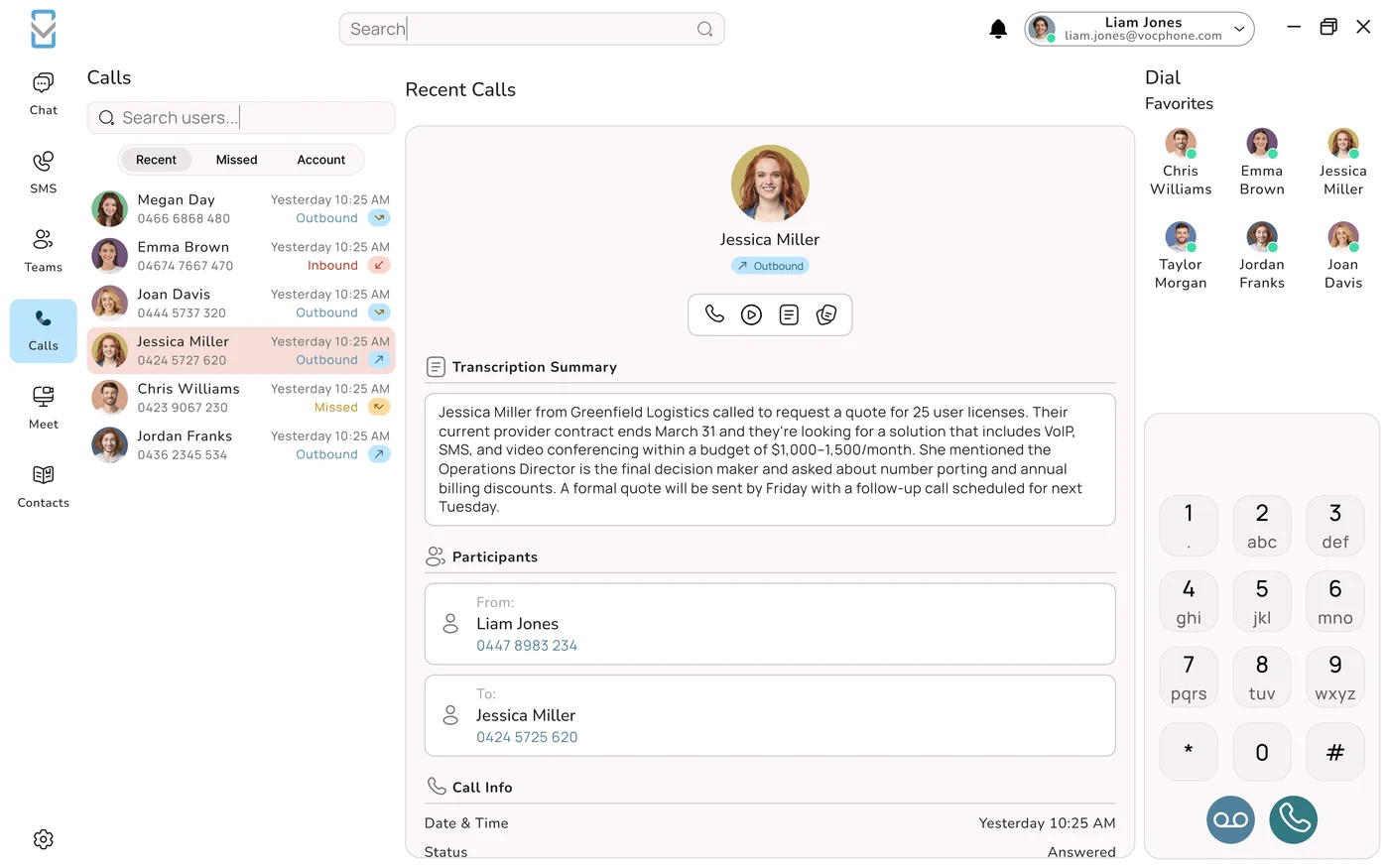
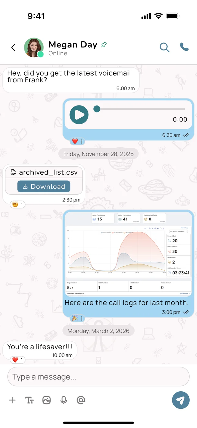
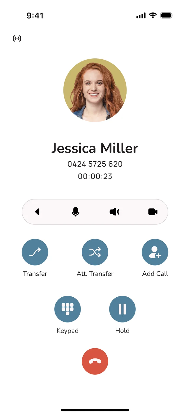
New Try it liveTake the VOCPhone apps for a spin, right here
Click through working demos of the desktop and mobile apps: calls with AI summaries, team chat, SMS and more. No download, no sign up.
Desktop app demoMobile app demoOur own network, not a reseller's. 99.99% uptime and support from our team in Australia.Book a demoAll features
AI on your phone line
VOCPhone vs AI receptionists
See every comparisonAI AgentsEvery call answered, day or night
It picks up with a natural Aussie accent, answers questions, books the job and sends you the summary.
Meet your AI agentBuilt into your phone system, not bolted on. No extra number, no call forwarding.Book a demo
Professional services
Trades, retail and hospitality
Browse all industries





Our customersFrom one-person shops to national brands
See how businesses like yours set up their phones.
Find your industryWorking on your own? We have plans made for sole traders and freelancers too.Self-employedStartups
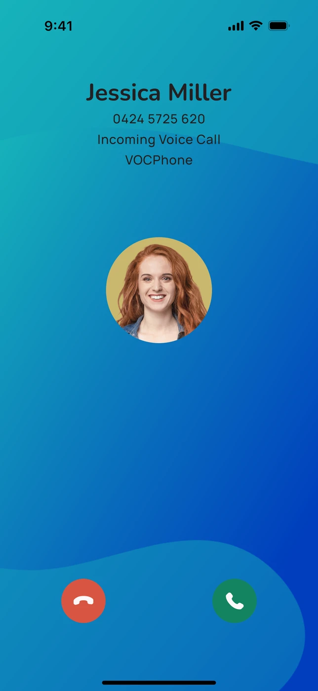
Voice plansBusiness phone planfrom$84.90/month3 users included on a 36-month term, then $30 per extra user.Free setup and free number portingDesktop and mobile apps includedAI Agents built inSee voice plans![Incoming call in the VOCPhone mobile app]()
![Friends watching a sunset]()
Internet and more

Bundle and savePhones and internet from one Aussie team
One provider to call when something needs fixing. No finger pointing.
Compare all plansMonth-to-month plans available. Keep your existing numbers when you move across.Sign up online1300 663 222
Learn and get set up
The library at a glanceBrowse all
141business
guides526kreads
so far
guides526kreads
so far
Guides by topic
- Phone systems54
- AI22
- NBN12
- Industries8
- Costs5
- Security4
- News2
- Other guides34


Need a hand? Our support team is based in Australia, with AI agents answering after hours.Contact support

Call us on 1300 663 222 or send a message and the team will get back to you.Send a message
Brand
Brand assets and guidelines
Logos, colour, type and the rules for using them. Take what you need.
Logos
60 files in the pack. Use SVG for anything digital or printed, and PNG only where a raster is required. SVG stays sharp at any size.
Primary lockup
The default. Use this everywhere unless you have a reason not to.


Reverse lockup
For dark backgrounds, photography and video.


Stacked
Square-ish spaces, print and merchandise.


One colour, ink
Single-colour printing, engraving, or anywhere colour is not available.


One colour, white
One colour on blue, photography or a busy background.


Icon
The mark on its own. Use it only where VOCPhone is already named nearby.


App icons and tiles
For app stores, favicons, avatars and anywhere square.




Space and size
Two rules cover most of it. Give the logo room, and do not run it smaller than it can survive.
Clear space: 25% of the icon's height, on all four sides. Nothing comes inside it. No type, no rules, no photo edges.
Minimum sizes
- Primary lockup28 px tall
- Compact lockup20 px tall
- Icon alone20 px tall
- App tile or favicon16 px
Below 28 px, switch to the compact lockup
The phone half of the wordmark is set in Light. Under about 28 px those hairlines start to break up, so the compact files set it in Regular instead. Below 20 px, drop the wordmark and use the icon on its own.
Colour
Click any swatch to copy its hex.
Keep the chevron lighter than the frame
On light grounds that is VOC Blue with a VOC Sky chevron. On dark it is Blue Lift with a white one. That relationship is what makes the mark read the same way in either theme, and the supplied files already handle it.
Typography
Sora
Headings and display. Set tight, with generous space around it.
Logotype
Inter, ExtraBold and Light
Drawn as outlines in every file. You never need the font installed to use the logo.
Headings
Sora, 700 and 800
Used across vocphone.com.
Body and UI
Inter, 400 to 600
Do and do not
The short version: use the files as supplied, give them room, and do not redraw anything.
Please do
Give it room
Keep the clear space clear on all four sides.
Use the supplied files
Always start from the artwork in the pack, never a screenshot.
Keep it legible
Respect the minimum sizes. If in doubt, go bigger.
Pick the right ground
Reverse on dark, primary on light. Check the contrast.
Please do not
Do not stretch or squash
Scale it proportionally, always.
Do not recolour it
Use the supplied colourways only.
Do not rotate or tilt
The logo sits level.
Do not add effects
No shadows, glows, bevels, gradients or outlines.
Buy now
Do not crowd it
Nothing inside the clear space.
VOCPhone
Do not rebuild it
Never re-type the name or redraw the mark.
Do not swap the two blues
The chevron is always the lighter of the two shapes. Flipping them makes the mark read as an inverse of itself.